Ricardo.ch
Senior Product Designer responsible for various projects – 4 years
I joined Ricardo, the biggest marketplace in Switzerland, in March 2018. During four years I worked on variety of projects: MVPs, small quick-wins, as well as big redesigns or KPI-driven initiatives. Some of them you can find below.
Project I was involved as a main ux designer resulted in:
- 8% revenue improved thanks to new search experience
- Completion rate of Item Listing Form improved by 35% on iOS, 5% on desktop web, 15% on Android
- Improved conversion rate on Product Page
- Streamlined process of redesign of legacy UIs
New listing experience
Supply of items for a second-hand marketplace is a strategic problem. To resolve frictions of users trying to list and sell their items we introduced set of improvements including ai-driven suggestions and new flow.
Ultimately, the completion rate was improved by 35% on iOS, 5% on desktop web and 15% on Android devices.

Problem
Listing an item is a key user journey. In 2021 Ricardo had no mobile-native flow for that, nor the process was easy for users. The key friction points were:
- Difficulties in taking photos (what type of photos, how to take them)
- Lack of knowledge about how to describe the item
- Selecting category was cumbersome
- Pricing an item was difficult and often resulted in overpriced (and not sold) items due to endowment effect
Solution
The design process started with alignment with PMs and key stakeholders on metrics and the baseline. A quantitative and qualitative research was conducted to identify fundamental problems, which later on was used to run set of ideation workshops and RICE matix.
A new flow was designed for web, Android and iOS (with help of a second UX designer). The team run set of A/B test and qualitative research (prototype and competitor testing) to validate ideas and designs.
Research
Design areas
Tools


Search Experience – from keyword search to language independent search with filters and attributes
As a designer in the Search and Exploration team I was responsible for designing a new search experience. In 2021 Ricardo was moving from classic text-based search to a more complex engine that was relying on product types and attributes. The goal was to make more effective recommendations for users.
With the search team in approx 20 months I managed to:
- Improve company revenue by 8% and made search language-independent
- Introduced new data model, filters for product types, new category tree, new autocomplete, suggestions

Problem
Search in 2020 in Ricardo was only keyword based and language dependent (in Switzerland four languages are used with German and French being the dominant ones). Making search results more meaningful for the user means higher conversion rate and lower frustration.
Problem example: User searches for iPhone 13 which should result in smartphones and not in smartphone covers and other accessories for iPhone 13.
Solution
This project started with understanding of search behaviours and patterns (best practices analisis, competitor analysis, data analysis). With the data team we a new data model was designed. Machine learning was needed for understanding and classification of all key product types and possible attributes for them.
With a migration plan and set of designs a rollout plan was created. It involved creating new category tree and attributes and a map between them (dependencies, weights, connections). that was (and probably still is) an ongoing process, since the inventory of one million products constantly evolves.
Once the data model was created, the user interface could be designed and tested. Each step of was carefully measured with a help of research team: qualitative (prototype testing, competitor testing) and quantitative (A/B tests, feedback analysis). It included web (desktop and mobile), Android and iOS.
Ultimately, Ricardo revenue growth was 8% compared to the previous search experience. I was the lead designer in that process. The whole project took approximately 20 months and it was a joint effort of data team and engineering team.
Research
Design areas
Tools

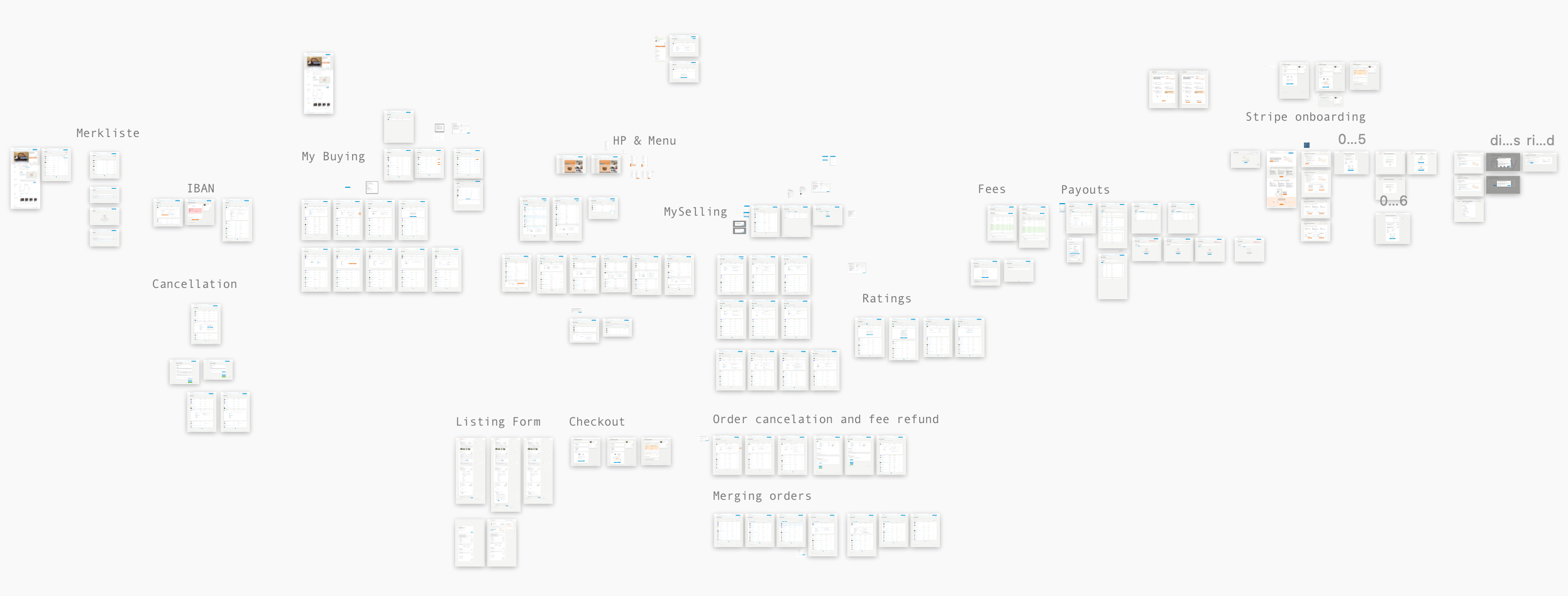
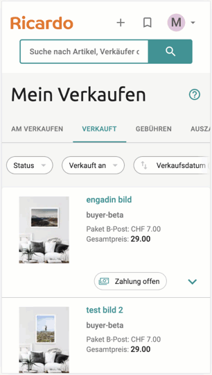
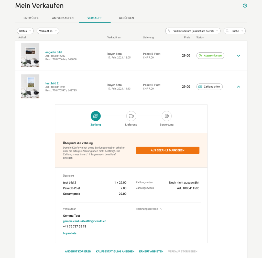
My Selling / My Buying
This project took more than 12 months and covered multiple user journeys. Dozens of iterations, hundreds of trade-offs, improvements of key flows for Ricardo, new information architecture and navigation, hours of research, tones of coffee.
All to bring give satisfaction and ease for our Buyers and Sellers.
Problem
MyRicardo – a back office for Sellers and Buyers was a decade old interface with outdated navigation patterns and cumbersome functionalities. It was not helping in the completion of even simple tasks like order tracking or managing offers. But first of all, it was not responsive and prepared for mobile devices.
This complex redesign covered multiple user journeys (for sellers and buyers) and required extensive collaboration between various teams and Product Managers. In this demanding project tradeoffs and transition steps were key challenges.
Solution
This project started with personas and Jobs to be Done analysis. The main focus was put on small sellers and regular buyers, who often use mobile phones to manage their inventory and orders. After the discovery phase, the team moved to low fidelity prototyping and user testing. I conducted a couple of Design Studio workshops with various designers. After reaching a certain confidence project was taken to the next stage of high fidelity prototyping and even more user testing.
Beta version was released and feedback was analysed. We managed to reach an extremely high retention rate in the new version, even if it was not covering all use cases. Once key bugs were addressed we moved to the next stage of introducing better guidance for order fulfilment process, so sellers and buyers had a better overview of their orders.
I was the lead designer in that process. The whole project took approximately 12 months and it was a joint effort of multiple dev teams, product managers, designers and researchers.
Research
Design areas
Tools
20% improvement for time-to-rate within 10 days for orders
At Ricardo we measure the time both sides (seller and buyer) take to complete the order and rate each other. Completion of time-to-rate within 10 days is a key metric that shows, how the aftersales process is performing. The more users rate each other, the better. It is a proxy metric for user satisfaction and ease of this process.
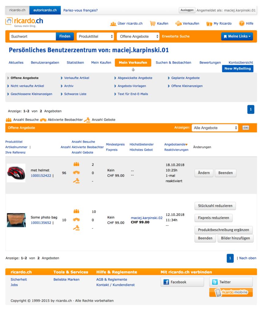
Old My Ricardo had complex and outdated navigation. Also, it was difficult to complete key tasks, simply because it required manual work and direct communication between buyers and sellers. The brave goal was to automate as much as possible, reduce the amount of manual task, speed up various processes and reduce customer care requests. And obviously – make it mobile-friendly.
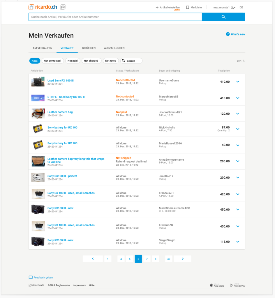
Simplified navigation and information architecture reduced time spent on each of the pages, making tasks easier to complete. Statuses of offers got clear labels and the product list became easier to scan.
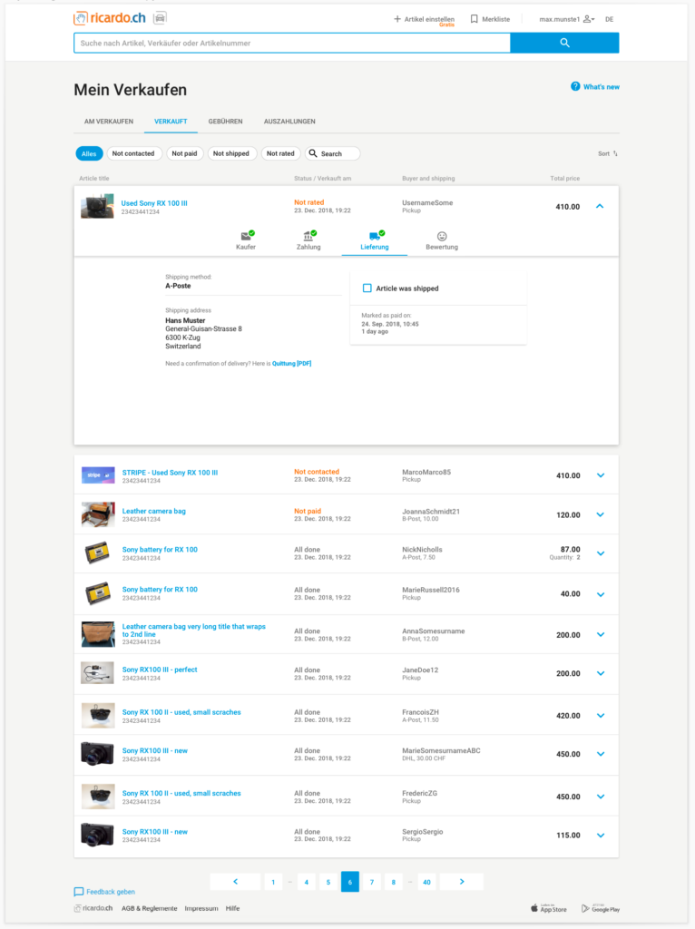
The after-sales process in the past required seller and buyer to exchange information about payments and shipping details which was time-consuming for both parties. To replace that a task-oriented UI was introduced. Sellers had step-by-step indicators allowing them to track the process easier. Slowly, more automation was introduced. Today, communication between seller and buyer in aftersales is not necessary.
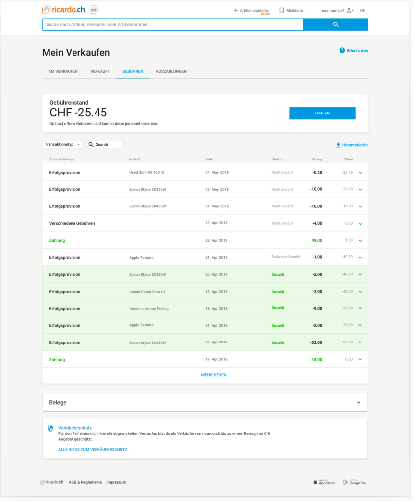
Apart from key user journeys like buying and selling, this project also covered an endless list of secondary processes like paying success fees, account management or cancellation flows.
Ultimately, both Buyers and Sellers have a unified aftersales process, that guides them and simplifies their tasks. Also, the need for contact between two parts is minimised.
Ricardo Product Page iterations
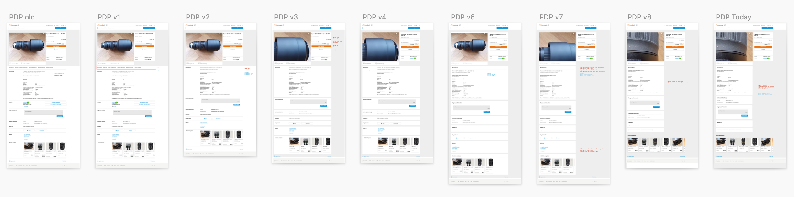
Problem
Old Product Page had too complex Information Architecture and was difficult to navigate. Due to such usability issues its conversion rate was not satisfactory.
Solution
Starting from pen and paper I went through a couple of iteration of PDP before jumping to high fidelity prototypes. Once the vision and direction were set, tested and validated with stakeholders, users and design team I prepared the process of small improvements and changes. The result was a smooth transition process from old PDP to the new one with A/B tests in every release stage.
Ultimate state with a content section on the right, clear information architecture, image gallery with thumbnails and sticky price box increased PDP’s conversion rate vastly!